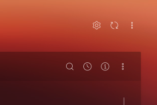
Action Icons
Action Icons are used to perform any actions within a title, list or inside any elements using icons.
Action Icons can be just <a> links or can be dropdown menu with links. Please refer the following example which includes both links and dropdown menu.
<div class="actions">
    <a href="" class="actions__item zwicon-cog"></a>
    <a href="" class="actions__item zwicon-refresh-double"></a>

    <div class="dropdown actions__item">
        <i data-toggle="dropdown" class="zwicon-more-h"></i>
        <div class="dropdown-menu dropdown-menu-right">
            <a href="" class="dropdown-item">Refresh</a>
            <a href="" class="dropdown-item">Manage Widgets</a>
            <a href="" class="dropdown-item">Settings</a>
        </div>
    </div>
</div>
Positioning the Action Icons
To override the position of the action-icons, you can simply add a modifier class on .actions and customize it as per your need.
e.g HTML
<div class="actions actions--list">
   ...
</div>
e.g CSS
.actions--list {
    float: right;
    margin-top: 10px;
    ...
}
Files required:
| Type | Files |
|---|---|
| Custom SCSS | /src/scss/inc/_misc.scss |