Colors
Convey meaning through color with a handful of color utility classes. Includes support for styling links with hover states, too.
Color
Utility text color casses from both Bootstrap and Super Admin 2.0.
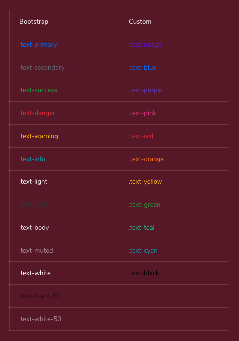
<p class="text-primary">.text-primary</p>
<p class="text-secondary">.text-secondary</p>
<p class="text-success">.text-success</p>
<p class="text-danger">.text-danger</p>
<p class="text-warning">.text-warning</p>
<p class="text-info">.text-info</p>
<p class="text-light">.text-light</p>
<p class="text-dark">.text-dark</p>
<p class="text-body">.text-body</p>
<p class="text-muted">.text-muted</p>
<p class="text-white">.text-white</p>
<p class="text-black-50">.text-black-50</p>
<p class="text-white-50">.text-white-50</p>
<p class="text-indigo">.text-indigo</p>
<p class="text-blue">.text-blue</p>
<p class="text-purple">.text-purple</p>
<p class="text-pink">.text-pink</p>
<p class="text-red">.text-red</p>
<p class="text-orange">.text-orange</p>
<p class="text-yellow">.text-yellow</p>
<p class="text-green">.text-green</p>
<p class="text-teal">.text-teal</p>
<p class="text-cyan">.text-cyan</p>
<p class="text-black">.text-black</p>Background
Easily set the background of an element to any contextual class. Anchor components will darken on hover, just like the text classes. Bootstrap background utilities do not set color so in some cases you’ll want to use .text-* utilities.
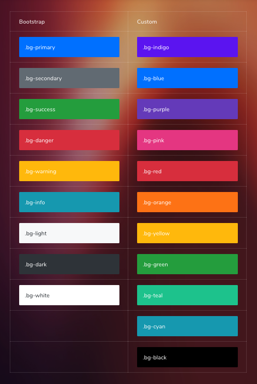
<div class="bg-primary">.bg-primary</div>
<div class="bg-secondary">.bg-secondary</div>
<div class="bg-success">.bg-success</div>
<div class="bg-danger">.bg-danger</div>
<div class="bg-warning">.bg-warning</div>
<div class="bg-info">.bg-info</div>
<div class="bg-light">.bg-light</div>
<div class="bg-dark">.bg-dark</div>
<div class="bg-white">.bg-white</div>
<div class="bg-transparent">.bg-transparent</div>
<p class="bg-indigo">.bg-indigo</p>
<p class="bg-blue">.bg-blue</p>
<p class="bg-purple">.bg-purple</p>
<p class="bg-pink">.bg-pink</p>
<p class="bg-red">.bg-red</p>
<p class="bg-orange">.bg-orange</p>
<p class="bg-yellow">.bg-yellow</p>
<p class="bg-green">.bg-green</p>
<p class="bg-teal">.bg-teal</p>
<p class="bg-cyan">.bg-cyan</p>
<p class="bg-black">.bg-black</p>SCSS Variables
Following colors are available in SCSS variables.
$white: #ffffff;
$black: #000000;
$blue: #007bff;
$indigo: #6610f2;
$purple: #6f42c1;
$pink: #e83e8c;
$red: #dc3545;
$orange: #fd7e14;
$yellow: #ffc107;
$green: #28a745;
$teal: #20c997;
$cyan: #17a2b8;
You can utilize these variables when needed by setting them as properties in CSS classes/IDs.
.highlight {
    color: $red;
    background-color: $green;
    border: 1px solid $blue;
}