Buttons
Use Bootstrap’s custom button styles for actions in forms, dialogs, and more with support for multiple sizes, states, and more.
Basic examples
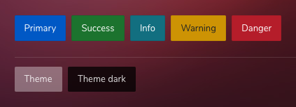
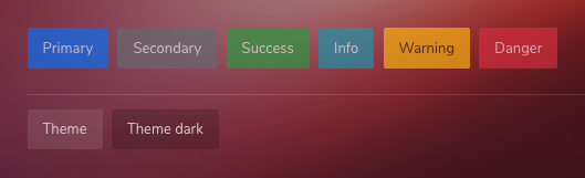
Bootstrap includes several predefined button styles, each serving its own semantic purpose, with a few extras thrown in for more control.
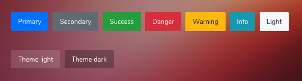
<button type="button" class="btn btn-primary">Primary</button>
<button type="button" class="btn btn-secondary">Secondary</button>
<button type="button" class="btn btn-success">Success</button>
<button type="button" class="btn btn-danger">Danger</button>
<button type="button" class="btn btn-warning">Warning</button>
<button type="button" class="btn btn-info">Info</button>
<button type="button" class="btn btn-light">Light</button>

<button type="button" class="btn btn-theme">Theme light</button>
<button type="button" class="btn btn-theme-dark">Theme dark</button>
Button tags
The .btn classes are designed to be used with the <button> element. However, you can also use these classes on <a> or <input> elements (though some browsers may apply a slightly different rendering).
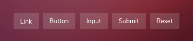
<a class="btn btn-primary" href="#" role="button">Link</a>
<button class="btn btn-primary" type="submit">Button</button>
<input class="btn btn-primary" type="button" value="Input">
<input class="btn btn-primary" type="submit" value="Submit">
<input class="btn btn-primary" type="reset" value="Reset">
Outline buttons
In need of a button, but not the hefty background colors they bring? Replace the default modifier classes with the .btn-outline-* ones to remove all background images and colors on any button.
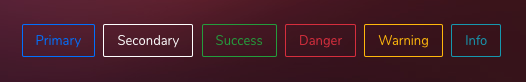
<button type="button" class="btn btn-outline-primary">Primary</button>
<button type="button" class="btn btn-outline-secondary">Secondary</button>
<button type="button" class="btn btn-outline-success">Success</button>
<button type="button" class="btn btn-outline-danger">Danger</button>
<button type="button" class="btn btn-outline-warning">Warning</button>
<button type="button" class="btn btn-outline-info">Info</button>
Button Icons
You can refer the Icons page for the complete list of Material Design font icons.
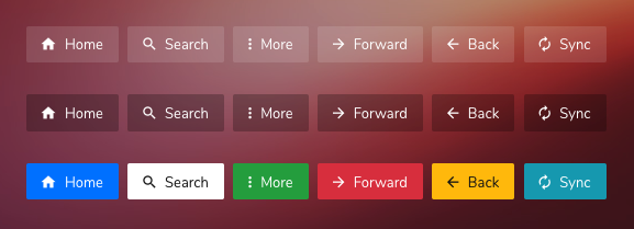
<button class="btn btn-theme btn--icon-text">
    <i class="zwicon-home"></i> Home
</button>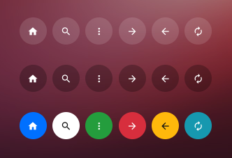
<button class="btn btn-light btn--icon">
    <i class="zmdi zmdi-home"></i>
</button>
Sizes
Fancy larger or smaller buttons? Add .btn-lg or .btn-sm for additional sizes.
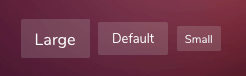
<button type="button" class="btn btn-theme btn-lg">Large button</button>
<button type="button" class="btn btn-theme btn-sm">Small button</button>Create block level buttons—those that span the full width of a parent by adding .btn-block.

<button type="button" class="btn btn-theme btn-block">Block level button</button>Button State
Active state
Buttons will appear pressed (with a darker background, darker border, and inset shadow) when active. There’s no need to add a class to <button>s as they use a pseudo-class. However, you can still force the same active appearance with .active (and include the aria-pressed="true" attribute) should you need to replicate the state programmatically.
<a href="#" class="btn btn-primary active" role="button" aria-pressed="true">Primary link</a>Disabled state
Make buttons look inactive by adding the disabled boolean attribute to any <button> element.
<button type="button" class="btn btn-primary" disabled>Primary button</button>Button Groups
Group a series of buttons together on a single line with the button group.
Wrap a series of buttons with .btn in .btn-group.
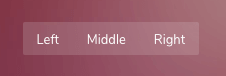
<div class="btn-group">
    <button type="button" class="btn btn-theme">Left</button>
    <button type="button" class="btn btn-theme">Middle</button>
    <button type="button" class="btn btn-theme">Right</button>
</div>Combine sets of .btn-group into a .btn-toolbar for more complex components.
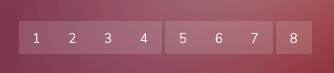
<div class="btn-toolbar">
    <div class="btn-group">
        <button type="button" class="btn btn-theme">1</button>
        <button type="button" class="btn btn-theme">2</button>
        <button type="button" class="btn btn-theme">3</button>
    </div>
    <div class="btn-group">
        <button type="button" class="btn btn-theme">4</button>
        <button type="button" class="btn btn-theme">5</button>
        <button type="button" class="btn btn-theme">6</button>
    </div>
    <div class="btn-group">
        <button type="button" class="btn btn-theme">7</button>
        <button type="button" class="btn btn-theme">8</button>
        <button type="button" class="btn btn-theme">9</button>
    </div>
</div>Instead of applying button sizing classes to every button in a group, just add .btn-group-* to each .btn-group, including when nesting multiple groups.
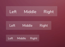
<!-- Large -->
<div class="btn-group btn-group-lg">
    <button type="button" class="btn btn-theme">Left</button>
    <button type="button" class="btn btn-theme">Middle</button>
    <button type="button" class="btn btn-theme">Right</button>
</div>

<!-- Default -->
<button type="button" class="btn btn-theme">Left</button>
    <button type="button" class="btn btn-theme">Middle</button>
    <button type="button" class="btn btn-theme">Right</button>


<!-- Small -->
<div class="btn-group btn-group-sm">
    <button type="button" class="btn btn-theme">Left</button>
    <button type="button" class="btn btn-theme">Middle</button>
    <button type="button" class="btn btn-theme">Right</button>
</div>Place a .btn-group within another .btn-group when you want dropdown menus mixed with a series of buttons.
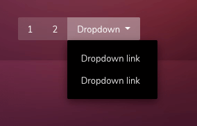
<div class="btn-group">
    <button type="button" class="btn btn-theme">1</button>
    <button type="button" class="btn btn-theme">2</button>

    <div class="btn-group">
        <button type="button" class="btn btn-theme dropdown-toggle" data-toggle="dropdown">Dropdown</button>
        <ul class="dropdown-menu">
            <li><a href="#">Dropdown link</a></li>
            <li><a href="#">Dropdown link</a></li>
        </ul>
    </div>
</div>
Vertical variation
Make a set of buttons appear vertically stacked rather than horizontally. Split button dropdowns are not supported here.
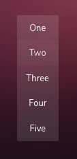
<div class="btn-group-vertical">
    <button type="button" class="btn btn-theme">One</button>
    <button type="button" class="btn btn-theme">Two</button>
    <button type="button" class="btn btn-theme">Three</button>
    <button type="button" class="btn btn-theme">Four</button>
    <button type="button" class="btn btn-theme">Five</button>
</div>| Type | Files |
|---|---|
| Custom SCSS | /src/scss/inc/bootstrap-overrides/_buttons.scss |