Button Checkboxes and Radios
Control button states or create groups of buttons for more components like toolbars.
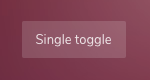
Toggle states
Add data-toggle="button" to toggle a button’s active state. If you’re pre-toggling a button, you must manually add the .active class and aria-pressed="true" to the <button>.
<button type="button" class="btn btn-theme" data-toggle="button" aria-pressed="false" autocomplete="off">
Single toggle
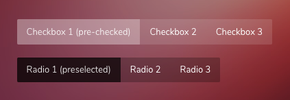
</button>Checkbox and Radio Buttons
Bootstrap’s .button styles can be applied to other elements, such as <label>s, to provide checkbox or radio style button toggling.
<!-- Checkbox -->
<div class="btn-group btn-group-toggle" data-toggle="buttons">
<label class="btn active">
<input type="checkbox" checked autocomplete="off"> Active
</label>
<label class="btn">
<input type="checkbox" autocomplete="off"> Check
</label>
<label class="btn">
<input type="checkbox" autocomplete="off"> Check
</label>
</div>
<!-- Radio -->
<div class="btn-group btn-group-toggle" data-toggle="buttons">
<label class="btn active">
<input type="radio" name="options" id="option1" autocomplete="off" checked> Active
</label>
<label class="btn">
<input type="radio" name="options" id="option2" autocomplete="off"> Radio
</label>
<label class="btn">
<input type="radio" name="options" id="option3" autocomplete="off"> Radio
</label>
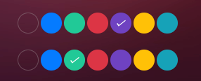
</div>Button color pickers
These toggle buttons are designed to pick a color from given list.
<!-- Checkbox -->
<div class="btn-group btn-group--colors btn-group-toggle" data-toggle="buttons">
    <label class="btn"><input type="checkbox" autocomplete="off" checked></label>
    <label class="btn bg-blue"><input type="checkbox" autocomplete="off"></label>
    <label class="btn bg-teal"><input type="checkbox" autocomplete="off"></label>
    <label class="btn bg-red"><input type="checkbox" autocomplete="off"></label>
    <label class="btn bg-purple active"><input type="checkbox" autocomplete="off"></label>
    <label class="btn bg-amber"><input type="checkbox" autocomplete="off"></label>
    <label class="btn bg-cyan"><input type="checkbox" autocomplete="off"></label>
</div>


<!-- Radio -->
<div class="btn-group btn-group--colors btn-group-toggle" data-toggle="buttons">
    <label class="btn"><input type="radio" name="notes-color" autocomplete="off" checked></label>
    <label class="btn bg-blue"><input type="radio" name="notes-color" autocomplete="off"></label>
    <label class="btn bg-teal active"><input type="radio" name="notes-color" autocomplete="off"></label>
    <label class="btn bg-red"><input type="radio" name="notes-color" autocomplete="off"></label>
    <label class="btn bg-purple"><input type="radio" name="notes-color" autocomplete="off"></label>
    <label class="btn bg-amber"><input type="radio" name="notes-color" autocomplete="off"></label>
    <label class="btn bg-cyan"><input type="radio" name="notes-color" autocomplete="off"></label>
</div>
Files required:
| Type | Files |
|---|---|
| Custom SCSS | /src/scss/inc/bootstrap-overrides/_buttons.scss |