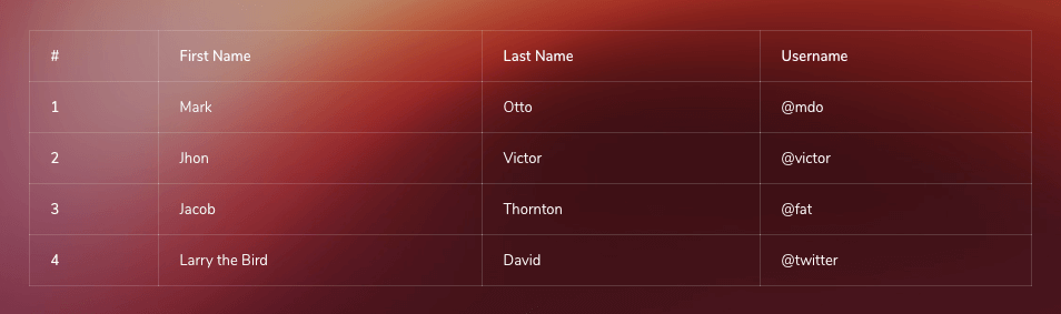
Basic Table
Basic example without any optional modifier classes.
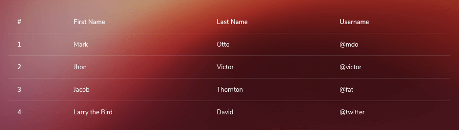
<table class="table">
  ...
</table>
Table Inverse
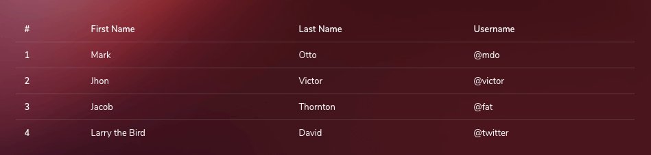
You can also invert the colors with light text on dark backgrounds—with .table-dark
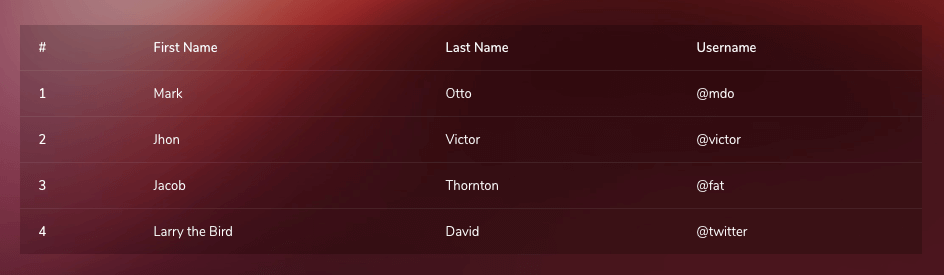
<table class="table table-dark">
  ...
</table>
Table head options
Similar to tables and dark tables, use the modifier classes .thead-light or .thead-dark to make <thead>s appear light or dark gray.
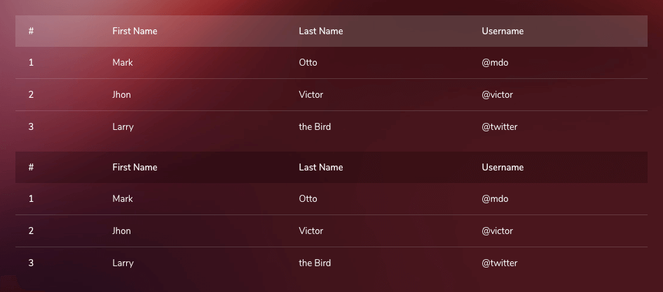
<table class="table">
  <thead class="thead-light">
    ...
  </thead>
  <tbody>
    ...
  </tbody>
</table>

<table class="table">
  <thead class="thead-dark">
     ...
  </thead>
  <tbody>
     ...
  </tbody>
</table>
Striped rows
Add zebra-striping to any table row within the tbody.
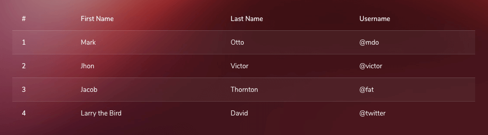
<table class="table table-striped">
  ...
</table>
Bordered table
Tables with borders on all possible sides of the Table and Cells.
<table class="table table-bordered">
  ...
</table>
Hover Row
Enable a hover state on table rows within a tbody.
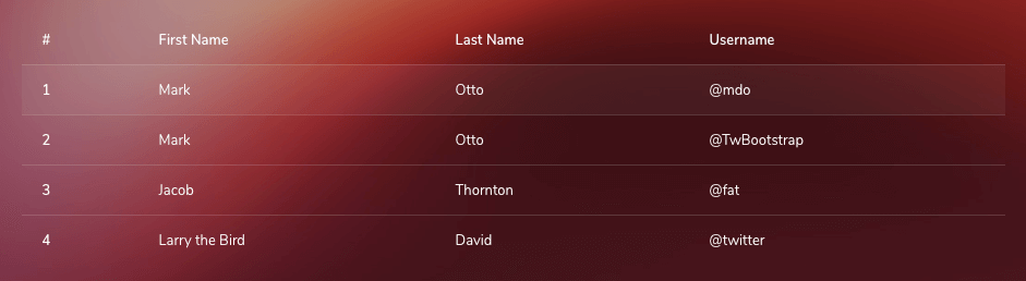
<table class="table table-hover">
  ...
</table>
Small table
Add .table-sm to make tables more compact by cutting cell padding in half.
<table class="table table-sm">
  ...
</table>
Responsive tables
Responsive tables allow tables to be scrolled horizontally with ease. Make any table responsive across all viewports by wrapping a .table with .table-responsive. Or, pick a maximum breakpoint with which to have a responsive table up to by using .table-responsive{-sm|-md|-lg|-xl}.
Across every breakpoint, use .table-responsive for horizontally scrolling tables.
<div class="table-responsive">
  <table class="table">
    ...
  </table>
</div>Use .table-responsive{-sm|-md|-lg|-xl} as needed to create responsive tables up to a particular breakpoint. From that breakpoint and up, the table will behave normally and not scroll horizontally.
<div class="table-responsive">
  <table class="table">
    ...
  </table>
</div>


<div class="table-responsive-md">
  <table class="table">
    ...
  </table>
</div>


<div class="table-responsive-lg">
  <table class="table">
    ...
  </table>
</div>


<div class="table-responsive-xl">
  <table class="table">
    ...
  </table>
</div>| Type | Files |
|---|---|
| Custom SCSS | /src/scss/inc/bootstrap-overrides/_tables.scss |