Form Elements
Form controls
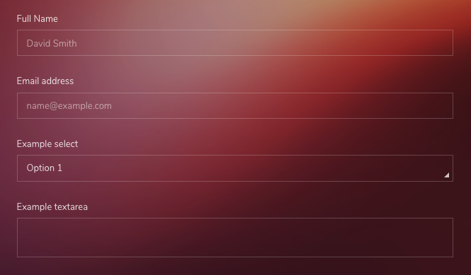
Textual form controls like <input>s, <select>s, and <textarea>s are styled with the .form-control class. Included are styles for general appearance, focus state, sizing, and more.
Text Inputs with different sizes by height.
<!-- Text -->
<div class="form-group">
    <label>Full Name</label>
    <input type="email" class="form-control" placeholder="David Smith">
</div>

<!-- Email -->
<div class="form-group">
    <label>Email address</label>
    <input type="email" class="form-control" placeholder="name@example.com">
</div>

<!-- Select -->
<div class="form-group">
    <label>Example select</label>
    <select class="form-control">
        <option>Option 1</option>
        <option>Option 2</option>
        <option>Option 3</option>
        <option>Option 4</option>
        <option>Option 5</option>
    </select>
</div>

<!-- Textarea -->
<div class="form-group">
    <label>Example textarea</label>
    <textarea class="form-control"></textarea>
</div>
Readonly
Add the readonly boolean attribute on an input to prevent modification of the input’s value. Read-only inputs appear lighter (just like disabled inputs), but retain the standard cursor.
<div class="form-group">
<input type="email" class="form-control" placeholder="Readonly Textual Input" readonly>
</div>
<div class="form-group mb-0">
<textarea class="form-control" readonly placeholder="Readonly Textarea"></textarea>
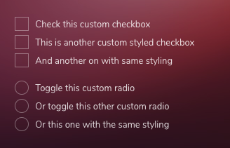
</div>Custom Checkboxes and Radios
These are custom styled checkbox and radios in order to prevent browser's default design.
<!-- Checkbox -->
<div class="custom-control custom-checkbox">
input type="checkbox" class="custom-control-input" id="customCheck1">
<label class="custom-control-label" for="customCheck1">Check this custom checkbox</label>
</div>
<!-- Radio -->
<div class="custom-control custom-radio">
<input type="radio" id="customRadio1" name="customRadio" class="custom-control-input">
<label class="custom-control-label" for="customRadio1">Toggle this custom radio</label>
</div>
<div class="custom-control custom-radio">
<input type="radio" id="customRadio2" name="customRadio" class="custom-control-input">
<label class="custom-control-label" for="customRadio2">Or toggle this other custom radio</label>
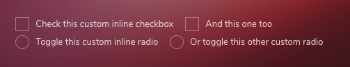
</div>Inline
Add class .custom-control-inline to make the inputs inline
<!-- Checkbox -->
<div class="custom-control custom-checkbox custom-control-inline">
    <input type="checkbox" class="custom-control-input" id="customCheckInline1">
    <label class="custom-control-label" for="customCheckInline1">Check this custom inline checkbox</label>
</div>
<div class="custom-control custom-checkbox custom-control-inline">
    <input type="checkbox" class="custom-control-input" id="customCheckInline2">
    <label class="custom-control-label" for="customCheckInline2">And this one too</label>
</div>

<!-- Radio -->
<div class="custom-control custom-radio custom-control-inline">
    <input type="radio" id="customRadioInline1" name="customRadioInline1" class="custom-control-input">
    <label class="custom-control-label" for="customRadioInline1">Toggle this custom inline radio</label>
</div>
<div class="custom-control custom-radio custom-control-inline">
    <input type="radio" id="customRadioInline2" name="customRadioInline1" class="custom-control-input">
    <label class="custom-control-label" for="customRadioInline2">Or toggle this other custom radio</label>
</div>
Disabled
Custom checkboxes and radios can also be disabled. Add the disabled boolean attribute to the <input> and the custom indicator and label description will be automatically styled.
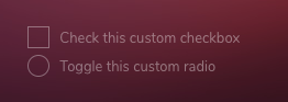
<div class="custom-control custom-checkbox">
    <input type="checkbox" class="custom-control-input" id="customCheckDisabled1" disabled>
    <label class="custom-control-label" for="customCheckDisabled1">Check this custom checkbox</label>
</div>

<div class="custom-control custom-radio">
    <input type="radio" name="radioDisabled" id="customRadioDisabled2" class="custom-control-input" disabled>
    <label class="custom-control-label" for="customRadioDisabled2">Toggle this custom radio</label>
</div>