Dropdown
Toggle contextual overlays for displaying lists of links and more with the Bootstrap dropdown plugin.
Single button dropdowns
Any single .btn can be turned into a dropdown toggle with some markup changes. Here’s how you can put them to work with either <button>elements.
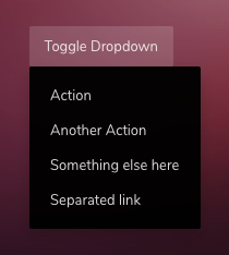
<div class="dropdown">
<button class="btn btn-theme" data-toggle="dropdown">Toggle Dropdown</button>
<div class="dropdown-menu">
<a href="" class="dropdown-item">Action</a>
<a href="" class="dropdown-item">Another Action</a>
<a href="" class="dropdown-item">Something else here</a>
<a href="" class="dropdown-item">Separated link</a>
</div>
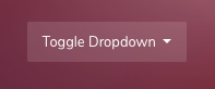
</div>You can use class .dropdown-toggle on element data-toggle="dropdown" to show caret next to the dropdown toggle text.
<button class="btn btn-theme dropdown-toggle" data-toggle="dropdown">Toggle Dropdown</button>Lighter Theme
Lighter theme can be applied on .dropdown-menu using the modifier class .dropdown-menu--invert
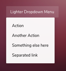
<div class="dropdown">
    <button class="btn btn-theme" data-toggle="dropdown">Toggle Dropdown</button>
    <div class="dropdown-menu dropdown-menu--invert">
        <a href="" class="dropdown-item">Action</a>
        <a href="" class="dropdown-item">Another Action</a>
        <a href="" class="dropdown-item">Something else here</a>
        <a href="" class="dropdown-item">Separated link</a>
    </div>
</div>
Split button dropdowns
Create split button dropdowns with virtually the same markup as single button dropdowns, but with the addition of .dropdown-toggle-split for proper spacing around the dropdown caret.
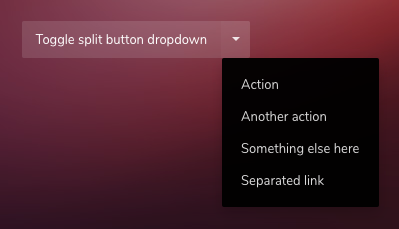
<div class="btn-group" dropdown>
    <button id="split-button" type="button" class="btn btn-theme">Toggle split button dropdown</button>
    <button type="button" class="btn btn-theme dropdown-toggle dropdown-toggle-split" data-toggle="dropdown"></button>

    <ul class="dropdown-menu">
        <li><a class="dropdown-item" href="#">Action</a></li>
        <li><a class="dropdown-item" href="#">Another action</a></li>
        <li><a class="dropdown-item" href="#">Something else here</a></li>
        <li><a class="dropdown-item" href="#">Separated link</a></li>
    </ul>
</div>
Trigger by non-button elements
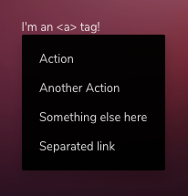
Dropdown can also be used with <a>, <span> or any other tags.
<!-- <a> tag -->
<div class="dropdown">
<a data-toggle="dropdown">I'm an <a> tag!</a>
<div class="dropdown-menu">
<a href="" class="dropdown-item">Action</a>
<a href="" class="dropdown-item">Another Action</a>
<a href="" class="dropdown-item">Something else here</a>
<a href="" class="dropdown-item">Separated link</a>
</div>
</div>
<!-- Icon -->
<div class="dropdown">
<i data-toggle="dropdown" class="zwicon-arrow-square-down"></i>
<div class="dropdown-menu">
<a href="" class="dropdown-item">Action</a>
<a href="" class="dropdown-item">Another Action</a>
<a href="" class="dropdown-item">Something else here</a>
<a href="" class="dropdown-item">Separated link</a>
</div>
</div>Disabled
Use disabled attribute on data-toggle="dropdown" to disable the toggle.
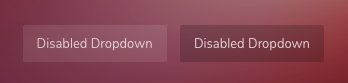
<div class="dropdown">
    <button class="btn btn-theme" data-toggle="dropdown" disabled>Disabled Dropdown</button>
    <div class="dropdown-menu">
        <a href="" class="dropdown-item">Action</a>
        <a href="" class="dropdown-item">Another Action</a>
        <a href="" class="dropdown-item">Something else here</a>
        <a href="" class="dropdown-item">Separated link</a>
    </div>
</div>
Disabled menu item
Add .disabled to items in the dropdown to style them as disabled.
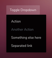
<div class="dropdown">
    <button class="btn btn-theme" data-toggle="dropdown">Toggle Dropdown</button>
    <div class="dropdown-menu">
        <a href="" class="dropdown-item">Action</a>
        <a href="" class="dropdown-item disabled">Another Action</a>
        <a href="" class="dropdown-item">Something else here</a>
        <a href="" class="dropdown-item">Separated link</a>
    </div>
</div>
Menu alignment
By default, a dropdown menu is automatically positioned 100% from the top and along the left side of its parent. Add class .dropdown-menu-right to a dropdown-menu to right align the dropdown menu.
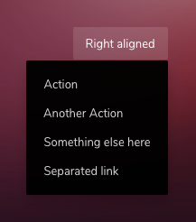
<div class="dropdown">
    <button class="btn btn-theme" data-toggle="dropdown">Right aligned</button>
    <div class="dropdown-menu dropdown-menu-right">
        <a href="" class="dropdown-item">Action</a>
        <a href="" class="dropdown-item">Another Action</a>
        <a href="" class="dropdown-item">Something else here</a>
        <a href="" class="dropdown-item">Separated link</a>
    </div>
</div>
Directions
Dropdown menu can be triggered in any of the four directions by using dropdown helper classes.
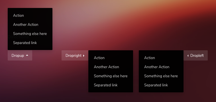
<!-- Up -->
<div class="dropup">
    <button class="btn btn-theme dropdown-toggle" data-toggle="dropdown">Dropup</button>
    <div class="dropdown-menu">
        <a href="" class="dropdown-item">Action</a>
        <a href="" class="dropdown-item">Another Action</a>
        <a href="" class="dropdown-item">Something else here</a>
        <a href="" class="dropdown-item">Separated link</a>
    </div>
</div>

<!-- Right -->
<div class="dropright">
    <button class="btn btn-theme dropdown-toggle" data-toggle="dropdown">Dropup</button>
    <div class="dropdown-menu">
        <a href="" class="dropdown-item">Action</a>
        <a href="" class="dropdown-item">Another Action</a>
        <a href="" class="dropdown-item">Something else here</a>
        <a href="" class="dropdown-item">Separated link</a>
    </div>
</div>

<!-- Left -->
<div class="dropleft">
    <button class="btn btn-theme dropdown-toggle" data-toggle="dropdown">Dropup</button>
    <div class="dropdown-menu">
        <a href="" class="dropdown-item">Action</a>
        <a href="" class="dropdown-item">Another Action</a>
        <a href="" class="dropdown-item">Something else here</a>
        <a href="" class="dropdown-item">Separated link</a>
    </div>
</div>
Menu contents
In addition to the links, dropdown menu can also have other contents such as text, dividers, forms etc.
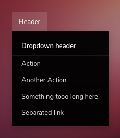
<div class="dropdown">
    <button class="btn btn-theme" data-toggle="dropdown">Header</button>
    <div class="dropdown-menu">
        <h6 class="dropdown-header">Dropdown header</h6>
        <a href="" class="dropdown-item">Action</a>
        <a href="" class="dropdown-item">Another Action</a>
        <a href="" class="dropdown-item">Something tooo long here!</a>
        <a href="" class="dropdown-item">Separated link</a>
    </div>
</div>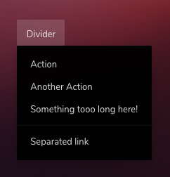
<div class="dropdown">
    <button class="btn btn-theme" data-toggle="dropdown">Divider</button>
    <div class="dropdown-menu">
        <a href="" class="dropdown-item">Action</a>
        <a href="" class="dropdown-item">Another Action</a>
        <a href="" class="dropdown-item">Something tooo long here!</a>
        <div class="dropdown-divider"></div>
        <a href="" class="dropdown-item">Separated link</a>
    </div>
</div>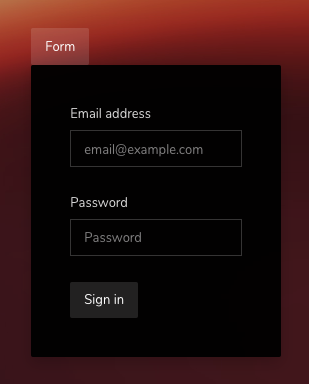
<div class="dropdown">
    <button class="btn btn-theme" data-toggle="dropdown">Form</button>
    <form class="dropdown-menu p-5" style="width: 250px;">
        <div class="form-group">
            <label>Email address</label>
            <input type="email" class="form-control" placeholder="email@example.com">
        </div>
        <div class="form-group">
            <label>Password</label>
            <input type="password" class="form-control" placeholder="Password">
        </div>
        <button type="submit" class="btn btn-theme">Sign in</button>
    </form>
</div>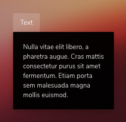
<div class="dropdown">
    <button class="btn btn-theme" data-toggle="dropdown">Text</button>
    <div class="dropdown-menu p-4" style="width: 200px;">
        Nulla vitae elit libero, a pharetra augue. Cras mattis consectetur purus sit amet fermentum. Etiam porta sem malesuada magna mollis euismod.
    </div>
</div>