Form Layouts
Since Bootstrap applies display: block and width: 100% to almost all our form controls, forms will by default stack vertically. Additional classes can be used to vary this layout on a per-form basis.
Form groups
The .form-group class is the easiest way to add some structure to forms. It provides a flexible class that encourages proper grouping of labels, controls, optional help text, and form validation messaging. By default it only applies margin-bottom, but it picks up additional styles in .form-inline as needed. Use it with <fieldset>s, <div>s, or nearly any other element.
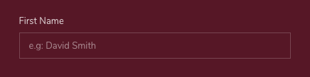
<div class="form-group">
    <label>First Name</label>
    <input type="text" class="form-control" placeholder="e.g: David Smith">
</div>
Form grid
More complex forms can be built using our grid classes. Use these for form layouts that require multiple columns, varied widths, and additional alignment options.
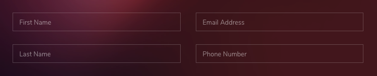
<form>
    <div class="row">
        <div class="col">
            <div class="form-group">
                <input type="text" class="form-control" placeholder="First Name">
            </div>

            <div class="form-group mb-0">
                <input type="text" class="form-control" placeholder="Last Name">
            </div>
        </div>
        <div class="col">
            <div class="form-group">
                <input type="text" class="form-control" placeholder="Email Address">
            </div>

            <div class="form-group mb-0">
                <input type="text" class="form-control" placeholder="Phone Number">
            </div>
        </div>
    </div>
</form>
Form row
You may also swap .row for .form-row, a variation of our standard grid row that overrides the default column gutters for tighter and more compact layouts.
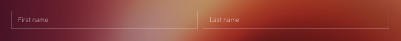
<form>
    <div class="form-row">
        <div class="col">
            <div class="form-group">
                <input type="text" class="form-control" placeholder="First name">
            </div>
        </div>
        <div class="col">
            <div class="form-group">
                <input type="text" class="form-control" placeholder="Last name">
            </div>
        </div>
    </div>
</form>More complex layouts can also be created with the grid system.
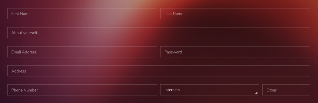
<form>
    <div class="form-row">
        <div class="col-md-6">
            <div class="form-group">
                <input type="email" class="form-control" placeholder="First Name">
            </div>
        </div>
        <div class="col-md-6">
            <div class="form-group">
                <input type="password" class="form-control" placeholder="Last Name">
            </div>
        </div>
    </div>
    <div class="form-group">
        <input type="text" class="form-control" placeholder="About yourself...">
    </div>
    <div class="form-row">
        <div class="col-md-6">
            <div class="form-group">
                <input type="email" class="form-control" placeholder="Email Address">
            </div>
        </div>
        <div class="col-md-6">
            <div class="form-group">
                <input type="password" class="form-control" placeholder="Password">
            </div>
        </div>
    </div>
    <div class="form-group">
        <input type="text" class="form-control" placeholder="Address">
    </div>
    <div class="form-row">
        <div class="col-md-6">
            <div class="form-group">
                <input type="text" class="form-control" placeholder="Phone Number">
            </div>
        </div>
        <div class="col-md-4">
            <div class="form-group">
                <div class="select">
                    <select class="form-control">
                        <option selected>Interests</option>
                        <option>...</option>
                    </select>
                </div>
            </div>
        </div>
        <div class="col-md-2">
            <div class="form-group">
                <input type="text" class="form-control" placeholder="Other">
            </div>
        </div>
    </div>
</form>
Horizontal form
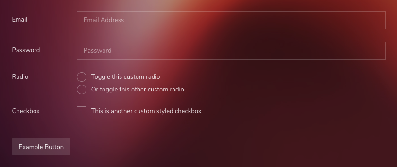
Create horizontal forms with the grid by utilizing the grid classes. Be sure to add .col-form-label to your <label>s as well so they’re vertically centered with their associated form controls.
<form>
    <div class="row">
        <label class="col-sm-2 col-form-label">Email</label>
        <div class="col-sm-10">
            <div class="form-group">
                <input type="email" class="form-control" placeholder="Email Address">
            </div>

        </div>
    </div>
    <div class="row">
        <label class="col-sm-2 col-form-label">Password</label>
        <div class="col-sm-10">
            <div class="form-group">
                <input type="password" class="form-control" placeholder="Password">
            </div>
        </div>
    </div>
    <div class="row">
        <label class="col-sm-2">Radio</label>
        <div class="col-sm-10">
            <div class="form-group">
                <div class="custom-control custom-radio mb-2">
                    <input type="radio" id="customRadio1" name="customRadio" class="custom-control-input">
                    <label class="custom-control-label" for="customRadio1">Toggle this custom radio</label>
                </div>
                <div class="custom-control custom-radio mb-2">
                    <input type="radio" id="customRadio2" name="customRadio" class="custom-control-input">
                    <label class="custom-control-label" for="customRadio2">Or toggle this other custom radio</label>
                </div>
            </div>
        </div>
    </div>

    <div class="row">
        <label class="col-sm-2">Checkbox</label>
        <div class="col-sm-10">
            <div class="custom-control custom-checkbox">
                <input type="checkbox" class="custom-control-input" id="customCheck2">
                <label class="custom-control-label" for="customCheck2">This is another custom styled checkbox</label>
            </div>
        </div>
    </div>

    <button type="submit" class="btn btn-theme mt-5">Example Button</button>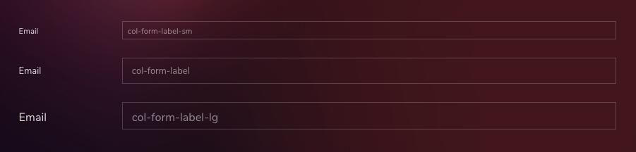
</form>Be sure to use .col-form-label-sm or .col-form-label-lg to your <label>s or <legend>s to correctly follow the size of .form-control-lg and .form-control-sm.
<form>
    <div class="row">
        <label class="col-sm-2 col-form-label col-form-label-sm">Email</label>
        <div class="col-sm-10">
            <div class="form-group">
                <input type="email" class="form-control form-control-sm" placeholder="col-form-label-sm">
            </div>
        </div>
    </div>
    <div class="row">
        <label class="col-sm-2 col-form-label">Email</label>
        <div class="col-sm-10">
            <div class="form-group">
                <input type="email" class="form-control" placeholder="col-form-label">
            </div>
        </div>
    </div>
    <div class="row">
        <label class="col-sm-2 col-form-label col-form-label-lg">Email</label>
        <div class="col-sm-10">
            <div class="form-group">
                <input type="email" class="form-control form-control-lg" placeholder="col-form-label-lg">
            </div>
        </div>
    </div>
</form>
Inline Forms
Use the .form-inline class to display a series of labels, form controls, and buttons on a single horizontal row. Form controls within inline forms vary slightly from their default states.
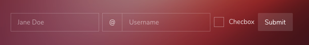
<form class="form-inline">
    <label class="sr-only" for="inlineFormInputName2">Name</label>
    <input type="text" class="form-control mb-2 mr-sm-2" id="inlineFormInputName2" placeholder="Jane Doe">

    <label class="sr-only" for="inlineFormInputGroupUsername2">Username</label>
    <div class="input-group mb-2 mr-sm-2">
        <div class="input-group-prepend">
            <div class="input-group-text">@</div>
        </div>
        <input type="text" class="form-control" id="inlineFormInputGroupUsername2" placeholder="Username">
    </div>

    <div class="custom-control custom-checkbox mb-2 mr-sm-2">
        <input type="checkbox" class="custom-control-input" id="customCheck3">
        <label class="custom-control-label" for="customCheck3">Checbox</label>
    </div>

    <button type="submit" class="btn btn-theme mb-2">Submit</button>
</form>
Help text
Block-level help text in forms can be created using .form-text. Inline help text can be flexibly implemented using any inline HTML element and utility classes like .text-muted.
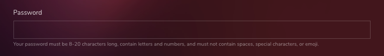
<div class="form-group">
    <label for="form-help-text">Password</label>
    <input type="password" id="form-help-text" class="form-control" aria-describedby="passwordHelpBlock">
    <small id="passwordHelpBlock" class="form-text text-muted">
        Your password must be 8-20 characters long, contain letters and numbers, and must not contain spaces, special characters, or emoji.
    </small>
</div>